This content has been archived. It may no longer be relevant
For many brands, their packaging design is an integral part of their product; the living, breathing heart and soul of the precious entity they’ve spent time, money, blood, sweat and tears creating.
If this rings true to you, then please consider Graphic Brands as the cardiothoracic surgeon – here to take care of hearts. Keeping them beating at the right rhythm and providing a kick of adrenaline and spark of electricity as and when needed.
Ok, so we’re not actually as smart as surgeons and we don’t wear scrubs to work, but what we do know is Packaging Design.
So, we’ve tapped into the minds of our wonderful designers and artworkers (our McDreamy’s if you will) and compiled a list of what we believe are the best packaging design trends right now. We’ve also gazed into our crystal ball to see what design trends you can expect to see more of in the future.
So, let’s scrub up and dive right into the heart of the matter…
GB LOVES – Our top 4 favourite design trends at Graphic Brands right now
1. Geometric, bold colour patterns

We’re kicking off this list with the bold and beautiful Geometric design. This design is a classic and there’s been a resurgence again in 2021, maybe because it’s so simple on the surface but packs a brilliant visual punch.
Neat lines and sharp angles give this style a literal edge. And does not give too much away as to what’s inside the packaging (that’s if you don’t read the text!). Perfect for those brands that would rather show their personality through a statement than intricate storytelling. The perfect mix of both modern and classic packaging design, making for an eye-catching and bold statement to customers.
2. Creative ‘Fun’ packaging design, integrating the product in the packaging

Ever seen packaging on the shelf and thought ‘Oh that’s clever’, or even laughed because it was a just a bit silly? If so, the packaging designer has done their job well, and you’ll remember that product and probably even tell others about it. ‘Fun’ packaging design takes elements of different design trends including bold colours, flat illustrations, and patterns and ties these in with a ‘function’ that presents the product, using the product itself as an integral part of the packaging design.
This is perfect for brands who want to add personality to their packaging design and make their product the key focus. We’ll admit, it’s not the right fit for every brand, but none-the-less it’s a brilliant design trend, and if your brand can utilise it then we say go for it!
3. Gradients

Gradients are usually considered a background detail to a design; however, gradients are fast becoming the main element on packaging. Gradients are a way of bringing a unique feeling of freshness and a depth that is surprising for something so simple.
We love it at Graphic Brands as it’s so unlike the use of block colours, illustrations, and the other trends on this list. This is brilliant for brands who adopt the gradient style as it stands out above the rest, and it’s fun for designers to create, as although it seems simple, there’s hundreds of variations of colours and gradients out there to be discovered.
4. Foiled and Embellished
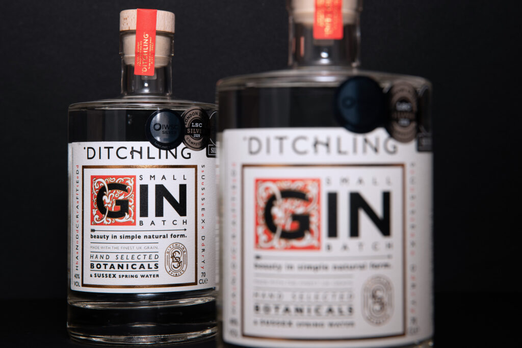
There’s no better way to portray a sense of luxury and sophistication than by adding foil and embellishment to your packaging. For the more luxurious products, usually associated with the beverage industry, foiling and embellishments in packaging design gives the product that high-quality edge and distinctiveness that is sure to excite consumers.
Designer: The Graphic Brands design & artwork team
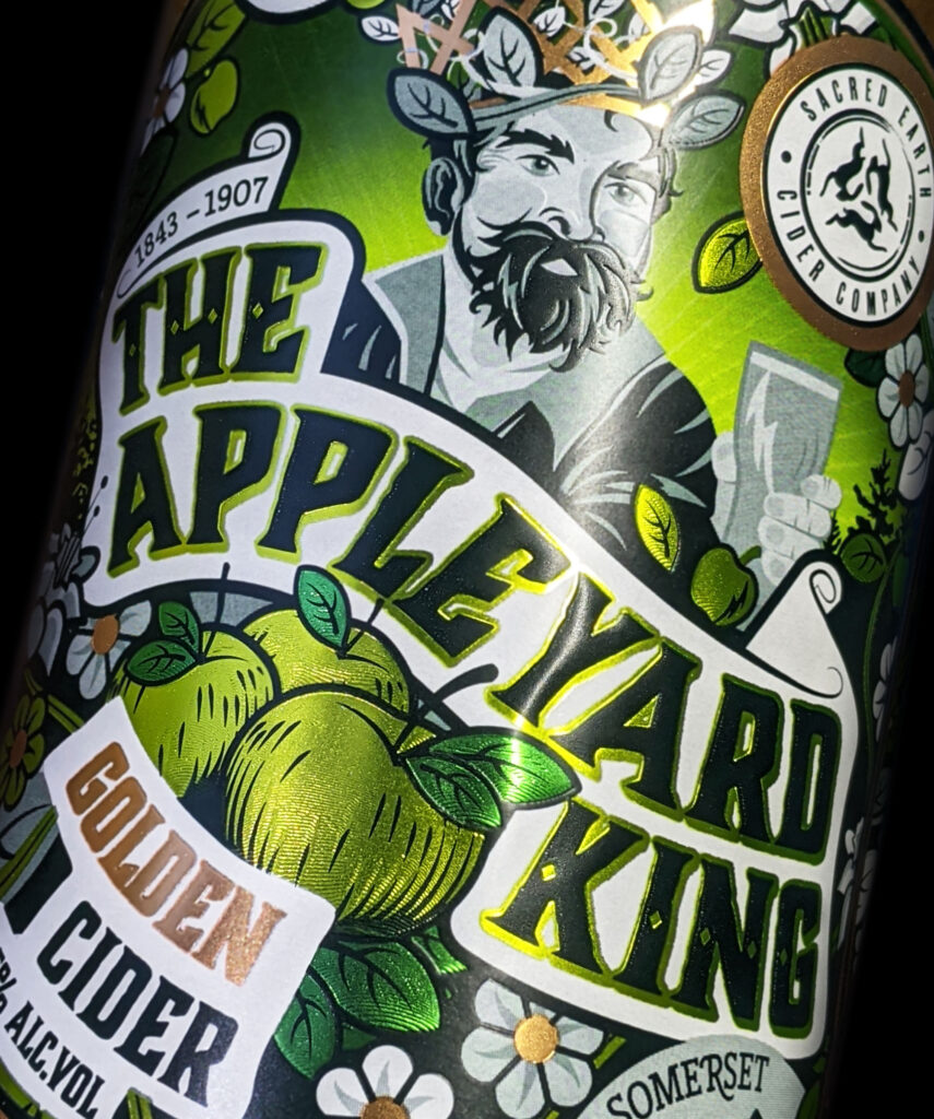
Embossed and foiled labels are a one of our favourite designs to create and then see come to life in print, the different textures and layers on the packaging creates a truly special visual and haptic experience for the consumer. Some of our favourite designs created at Graphic Brands use this trend as a key element, our most notable is the award-winning label for ‘The Cider King’ which you can read more about here.
GB Predicts – Our Packaging Design Trends predictions for 2022
Time to get our crystal ball out and predict what packaging design trends we think may emerge in 2022. Design can be unpredictable sometimes, ANYTHING could happen but, here it goes…
1. More sustainably led packaging design
Sustainable, eco-friendly packaging has been considered somewhat of a novelty in the past, something ‘nice to have’. However, in more recent years sustainable packaging has been on the rise and in demand from brands and consumers, and for good reason too!
But beyond recyclable packaging (which is available from Reflex, if you’re interested), designers will increasingly need to consider how you can visually demonstrate sustainability if it’s at the heart and soul of a product or brand. And with more sustainable, home-grown brands being created in in the past few years, we think it will be the most important emerging trend in 2022 for small businesses and will begin to be more prominent in larger corporations.
2. Bringing Retro Back
Retro packaging design has been an ongoing trend for the past few years, but more recently we’re seeing that people are loving a little bit of nostalgia.
After an unusual few years (understatement of the century!), we’ve seen that there has been a shift in people’s values. People are more nostalgic of times past, putting down their phones to enjoy time with family and striving towards a better work/life balance to enjoy nature and the simpler things in life. This is being reflected in brands that have noticed this change. Whether they are celebrating an anniversary in the business, or are trying to evoke a stop on the nostalgia train, brands are increasingly harking back to their roots and asking designers to provide a new twist on their classic designs. We think there’ll be some familiar packaging on the shelves in the next year.
3. Bold, bright colours
Step aside pastels, you’re sooo last year. As much as we loved the emergence of pastel colours in 2020 and 2021, it’s now time for something bolder and brighter. Psychologist say colour affects our mood, and that’s probably why consumers and brands are wanting something that connotates happiness and optimism – because, well you don’t need us to tell you the past few years has been full of the opposite.
Bright block colours on packaging really draws the eye towards a product on the shelf. As the market becomes more extensive, it is essential for brands to retain their shelf presence and appeal to new, as well as existing, consumers. We think that we’ll see more of these bold, bright colours along with minimalistic branding so that the eye is drawn to the packaging and then it is immediately clear what the product is. This marries the minimalist trend of past years with the upcoming bolder colour palette to inject a bit of life into market.
4. Functional Packaging
Now this might sound like an odd one because surely all packaging should be functional? But bear with us…
Predominantly seen in the health and beauty market so far, some brands are opting to tone down the ‘noise’ in their product packaging and have functional, greyscale packaging with only the essential information displayed. These products now stand out due to their simple functionality are often trusted, in the health and beauty market certainly, due to the appearance of a ‘no-nonsense’ product. No fancy fonts, bright colours and false promises. Now, of course this can’t work for every product, but when it suits your brand or product, this can be a really effective approach to marketing and we think more people are going to pick up on this and use it to promote their products. Don’t be fooled though, often simplistic designs are the most difficult to achieve so make sure your designer knows exactly what you’re after!
A final word from us…
We love all of these concepts and designing all sorts of different products (thankfully, seeing as it’s our job!) but obviously we’re not saying your product needs to use these. At the end of the day, above all else, your product packaging should be perfectly suited to your brand and message; easily conveying the business’ ethos and attracting the ideal consumer. This is where your designer is so important and we make a commitment to each and every client to truly understand the goals of the brand to make sure the branding and packaging fits perfectly.
Want to refresh your product packaging design? or have a new project in mind? Get in touch!
By Emma Collins & Lucy Green


