Crafting a Sea-stainable Ethos.
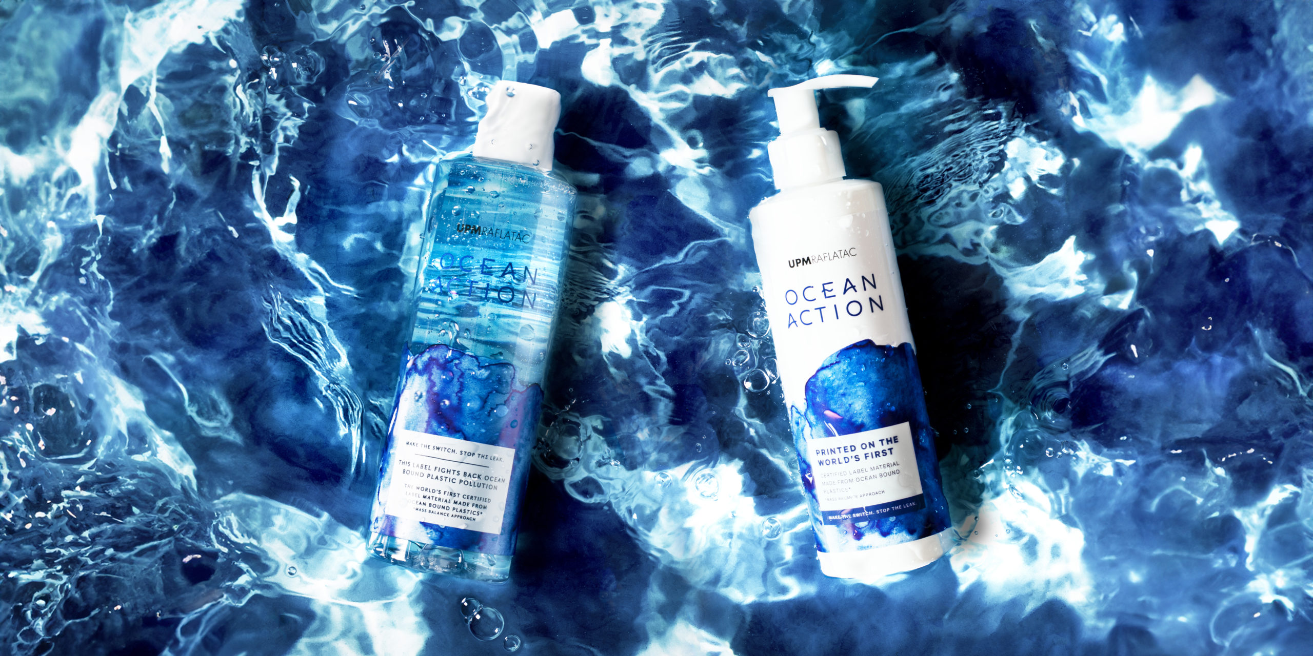
UPM Raflatac, a global leader in materials, unveiled their ground-breaking label material derived from ocean-bound plastics, perfectly named Ocean Action. This innovative solution, crafted from plastic waste retrieved within 50km of shorelines and chemically recycled, serves as a barrier against the pollution threatening our oceans.
For the Ocean Action launch, UPM Raflatac needed an impactful brand and packaging design to sit within a collection of visually stunning images that would captivate hearts and minds, embodying the essence of their brand’s mission. Our job was to bring that vision to life.
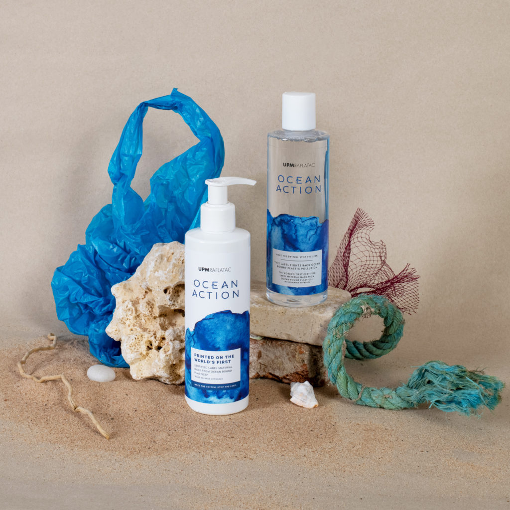
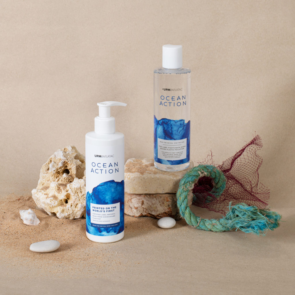
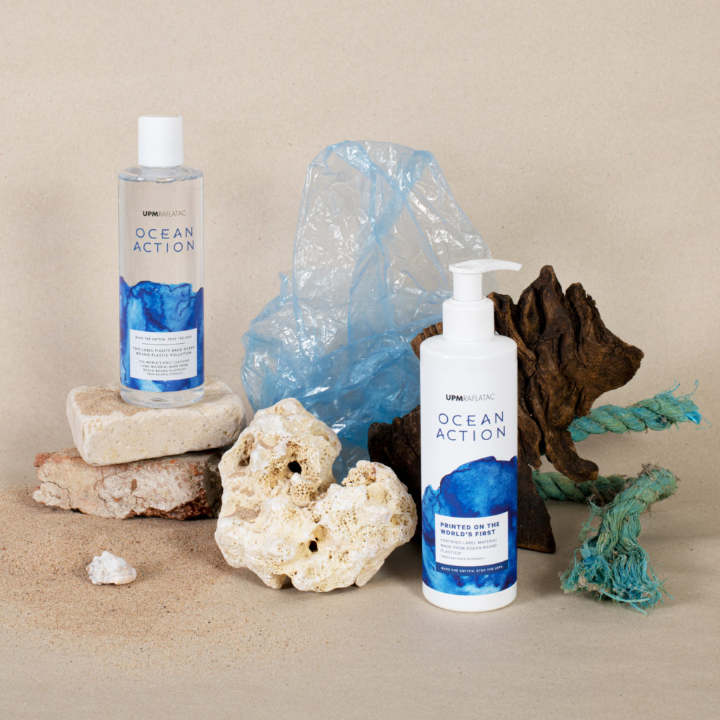
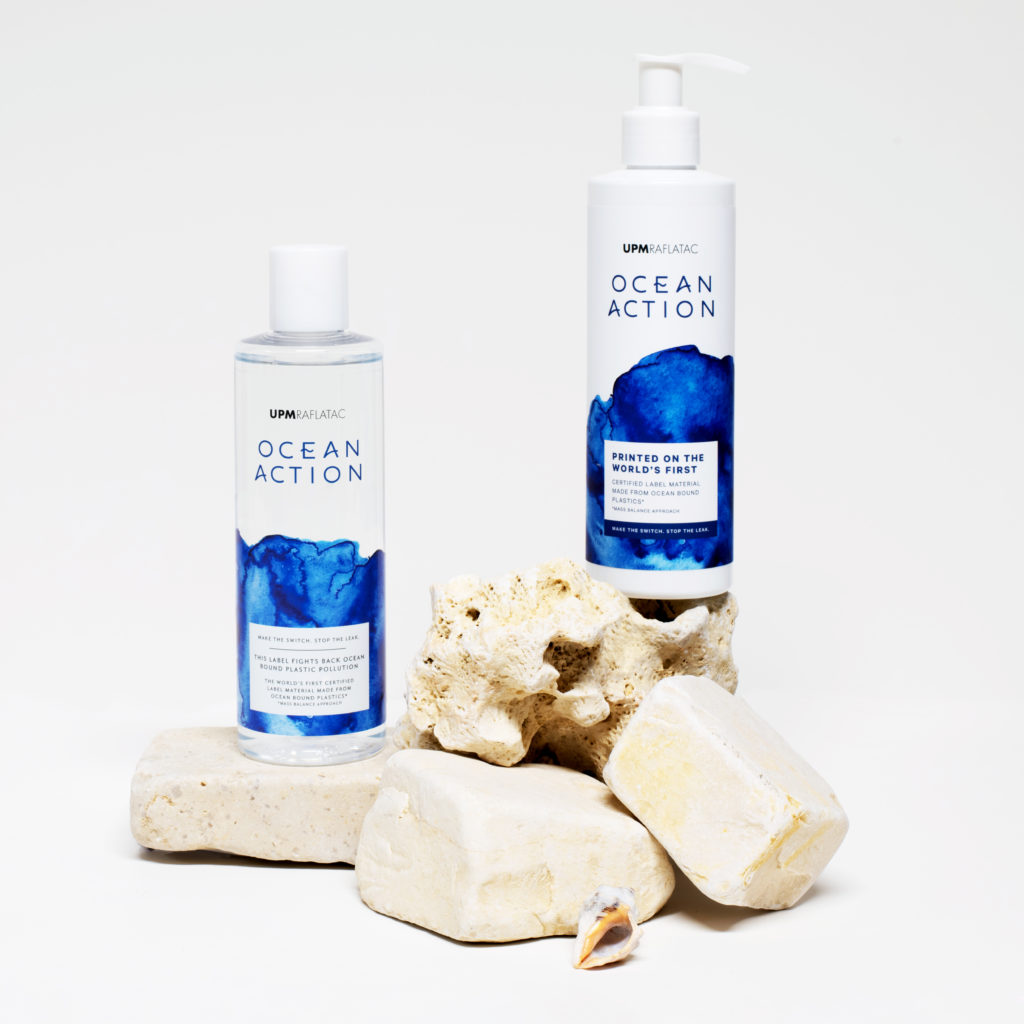
To keep the brand ethos at the forefront of everything, the brand aesthetic needed to be one of purity and simplicity. The Ocean Action brand mark, is meticulously crafted, with subtle nods to waves through curved cross bars. Inspired by the movement of water, watercolour patterns formed the base of the label design, with hues of deep blue echoing the ocean’s vastness.
Immersing ourselves into the brand’s ethos, and using our in-house Proof+ team to print labels and backdrops for the shoot, we were able to minimise waste. Only using props found in our studio or that we could borrow, we created a suite of images that perfectly embodied the brand’s vision for a brighter, more sustainable future.
Transforming Waste into Waves of Change