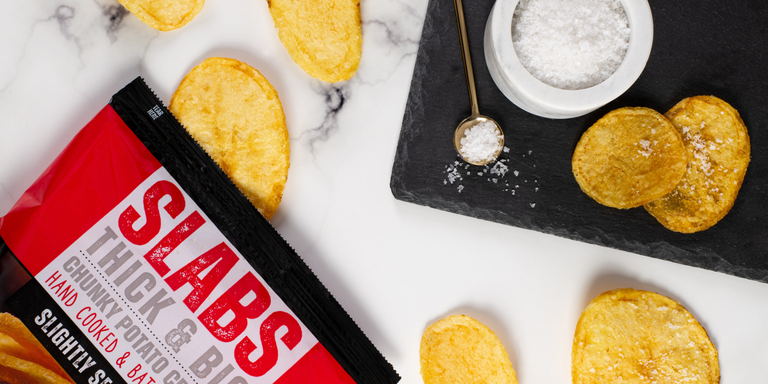
A deliciously chunky, artisan crisp with real bite & taste like no other.
Well-established snack brand, Great Food Affairs, needed something bold and impactful to live up to the name of their latest crisp brand, SLABS. Boasting to be four times bigger and thicker than your average crisp, SLABS offer crisp lovers everywhere a truly unique snacking experience and a flavour range to suit everyone’s tastes!
The SLABS brand design seamlessly aligns with the product’s essence — striking, influential, and attention-grabbing. The packaging design places a strong emphasis on showcasing the product, featuring an up-close image of the crisps, to demonstrate their truly magnificent scale. Adopting a minimalist approach throughout the rest of the packaging, this design called for bold, chunky typography to complete the aesthetic appeal.
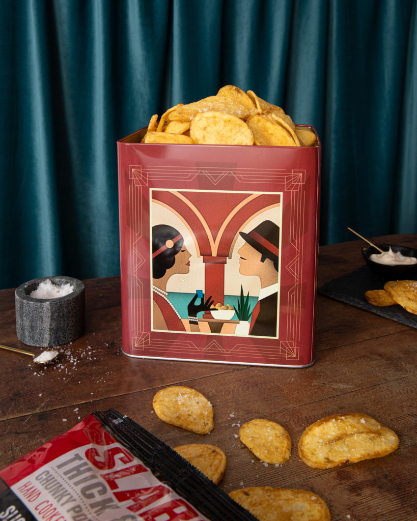
Recently, SLABS launched a set of three retro-inspired crips tins, one for each of their core flavours, with an intricate design tapping into 1930’s nostalgia. Each tin is adorned with gold vintage style details, paired with the bold SLABS typography, and a set of unique, art-deco style illustrations.
Deliciously Chunky Snacks