
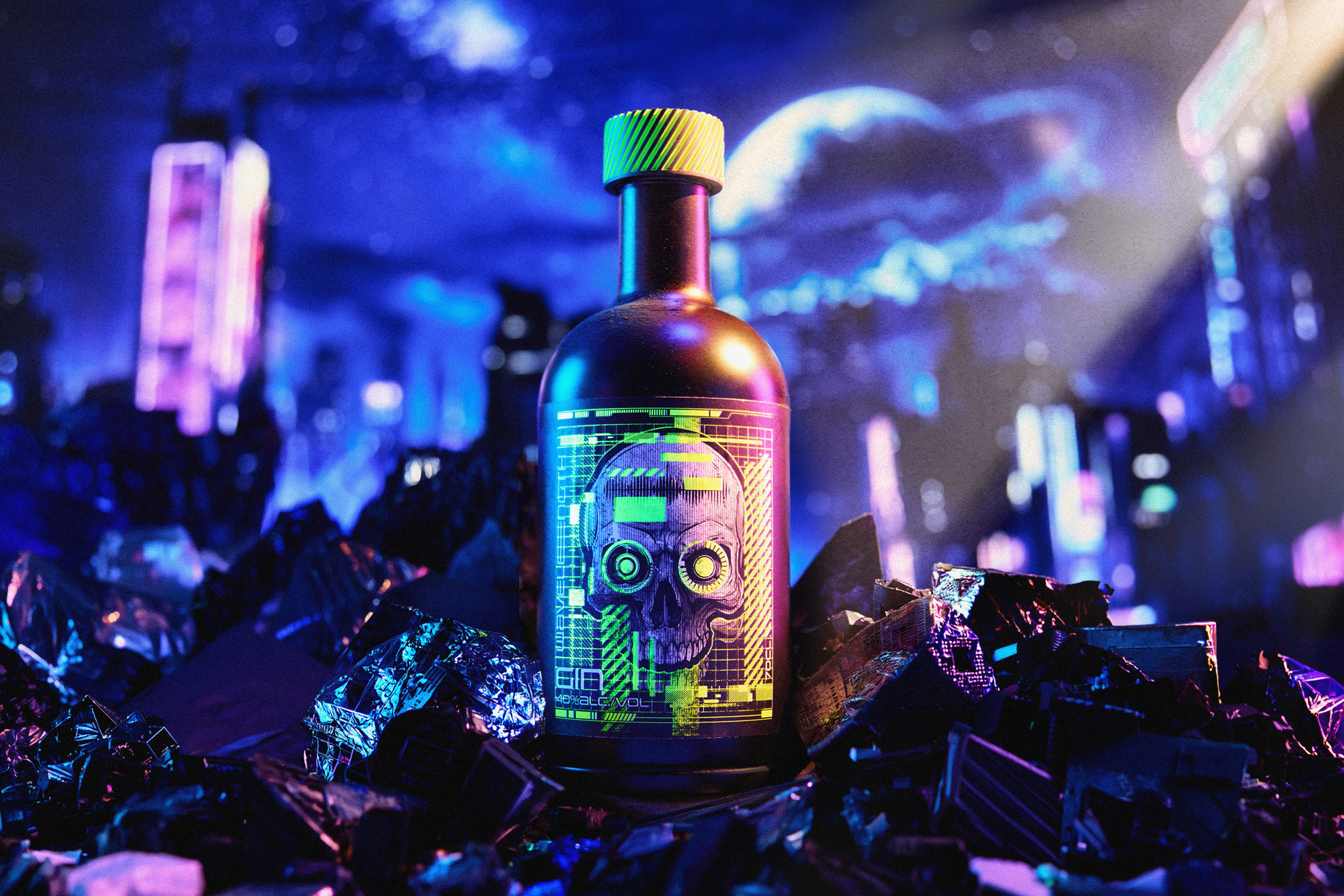
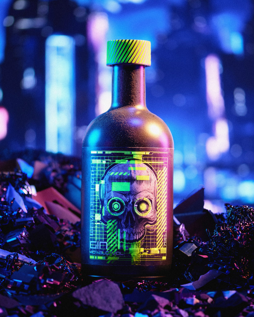
Wavelength began with a world rather than a bottle. In a city where technology has taken over human sight, filtering, correcting and quietly editing everything people see, a rebel crew distils a spirit for those who want their perception back. Unmediated, unfiltered and faintly illicit. Every decision that followed came out of that premise: the name, the palette, the artwork, and the central idea the whole design rests on, that the label should look like one thing in daylight and reveal something else entirely under ultraviolet. The brand is about what your own eyes can see, so seeing it properly depends on the light you are standing in.
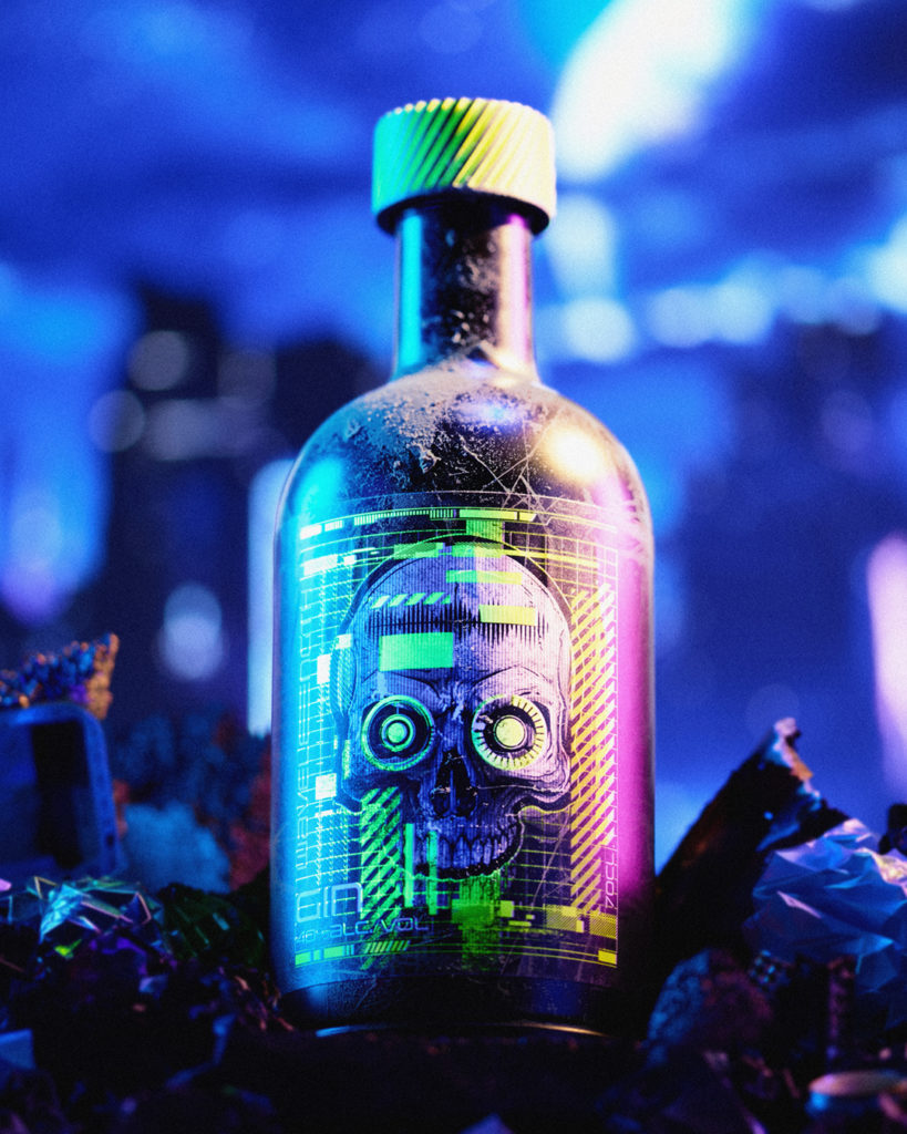
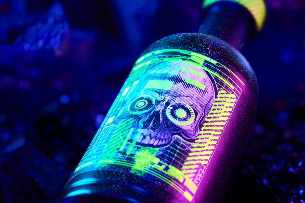
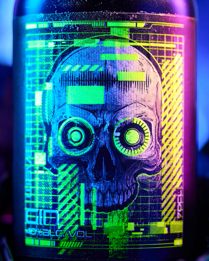
Created as part of Alive By Night, the UV-reactive label series developed with Foilco, Wavelength uses fluorescent foils that are vivid in daylight and luminous under blacklight. Fluorescents do not behave like conventional metallics, and establishing where the foil reads as a highlight and where it takes over the label took genuine technical adaptability, developed with support from Foilco and print expertise from Proof+. That work could only be done physically. You make it, you turn the lights off, and you look.
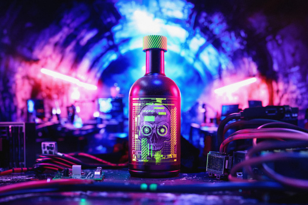
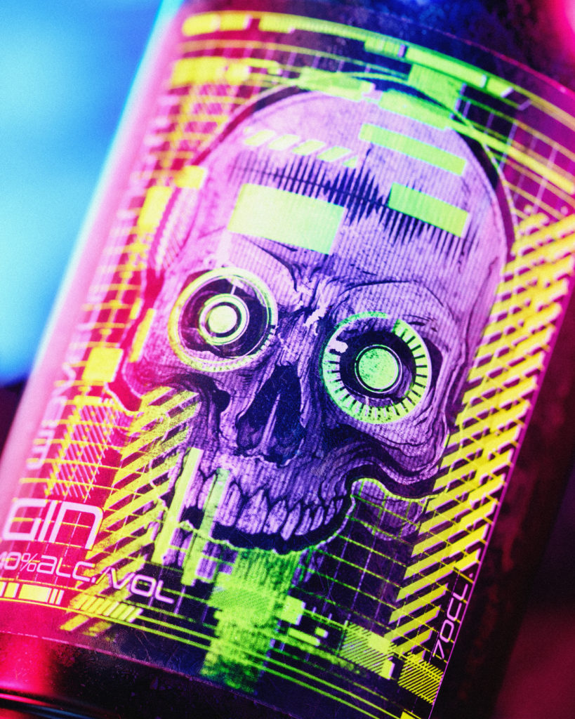
The photography borrowed from set building and virtual production rather than conventional studio practice. Wavelength needed environments no location could supply, so the shoot ran like a small film production: virtual production for the world behind the bottle, physical props and real surfaces in the foreground, and rapid changeovers between scenes. Reconfiguring an entire city took minutes rather than the days a physical build would demand, which left room to experiment, change the angle, change the mood, change the world and shoot it again. Practical and digital elements had to agree with each other in camera rather than being reconciled afterwards. Half film set, half computer, and entirely of a piece with a brand about the reliability of what you can see.
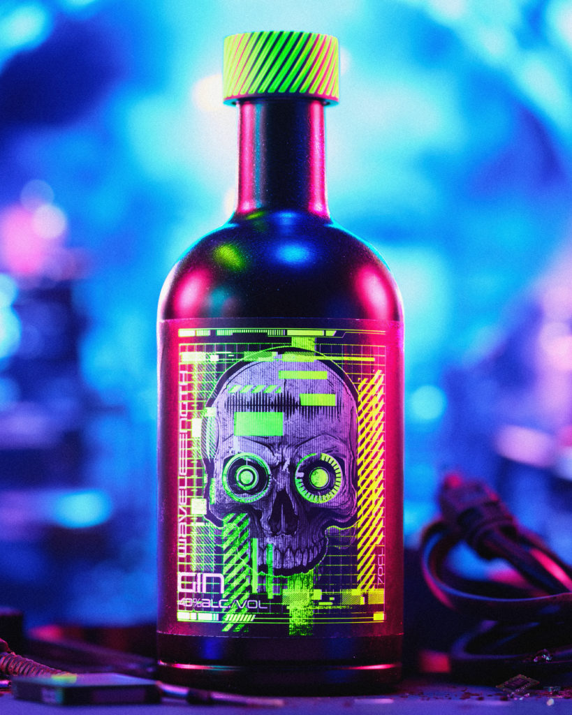
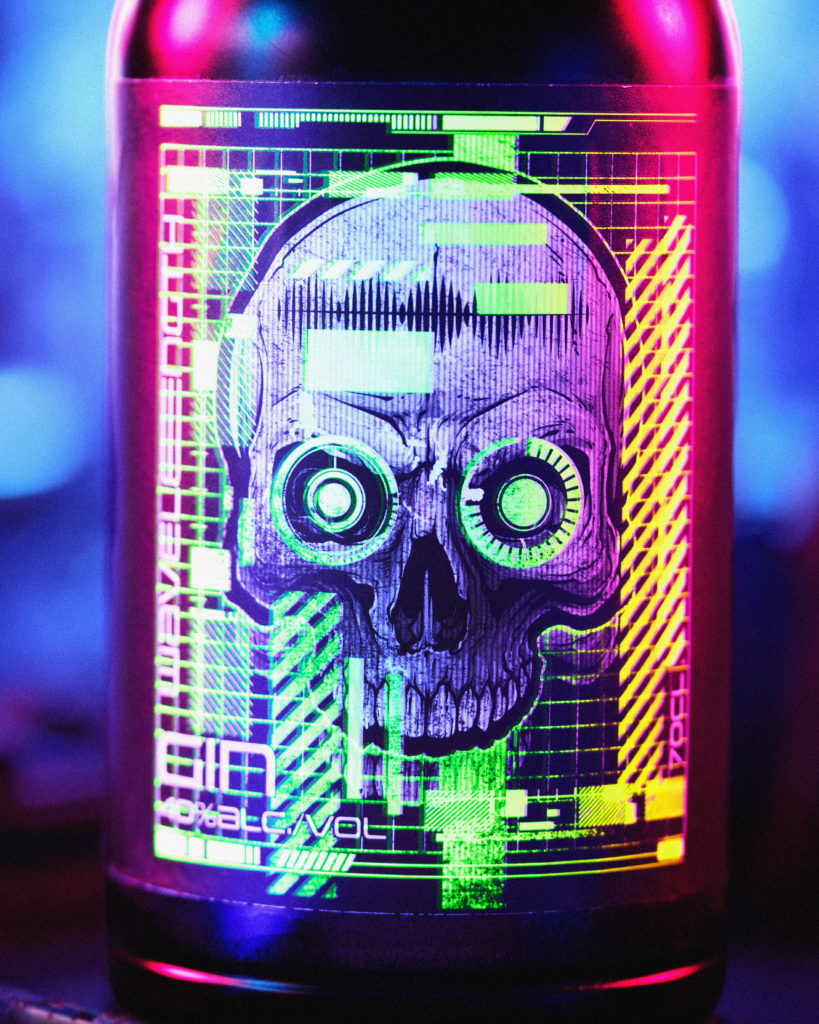
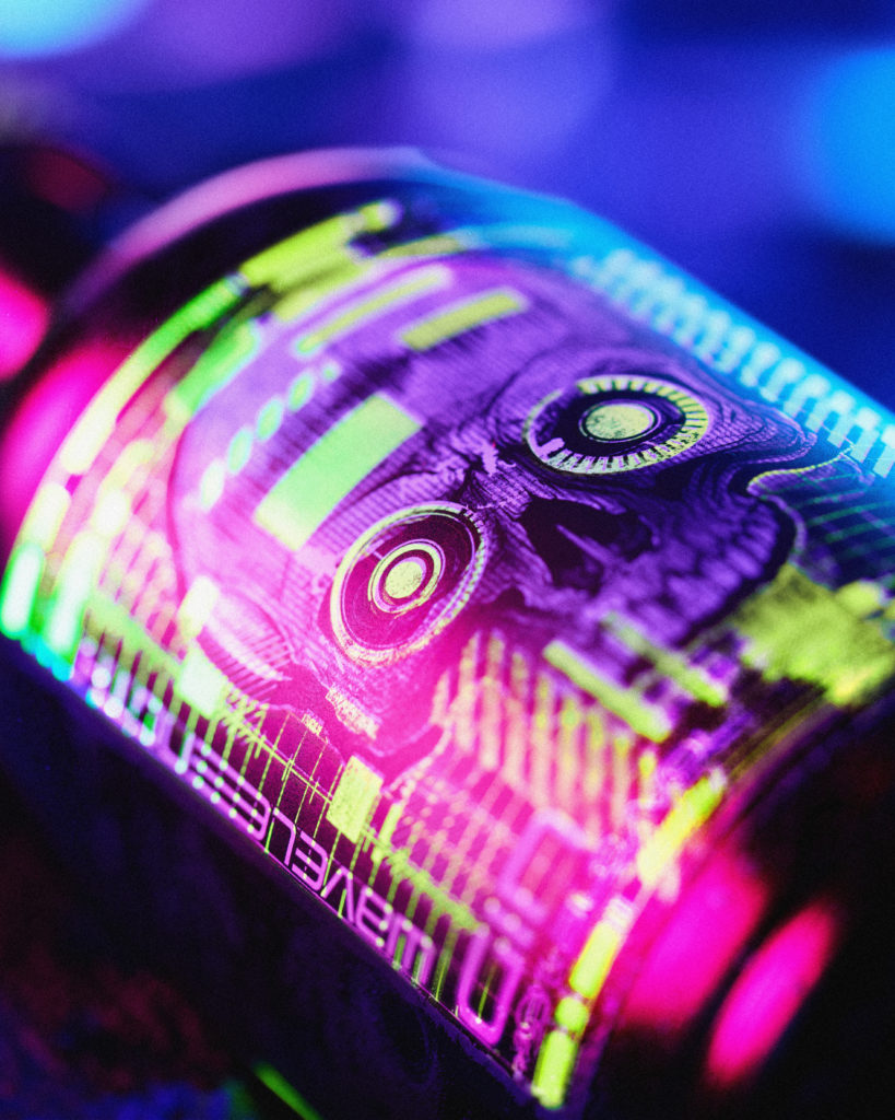
Wavelength is a concept, but nothing about it is theoretical. The world was written, the brand was designed, the labels were printed on production materials and the photography was shot for real. It exists as a demonstration of what becomes possible when the story, the print finish and the image are developed together rather than handed between separate teams and of how far a brand can go when the finish is treated as part of the idea rather than a decision made at the end.
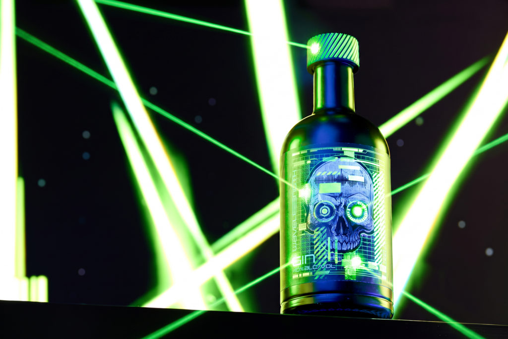
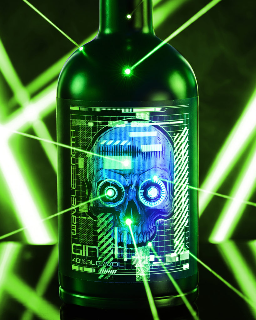
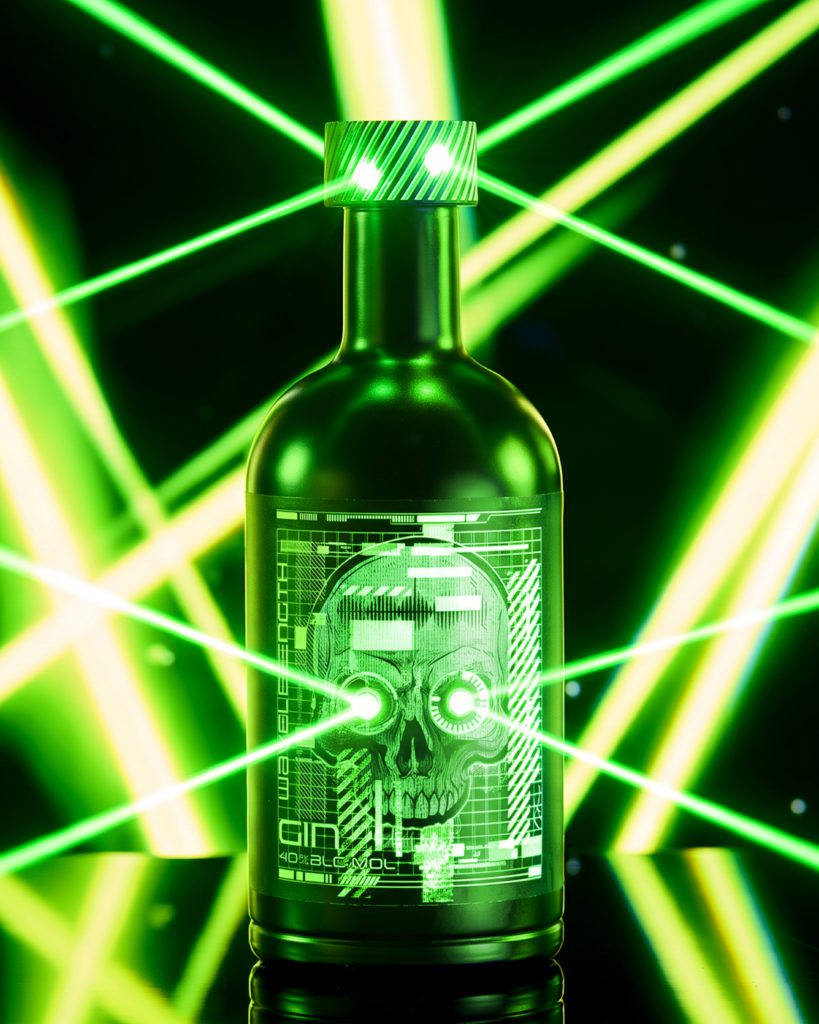
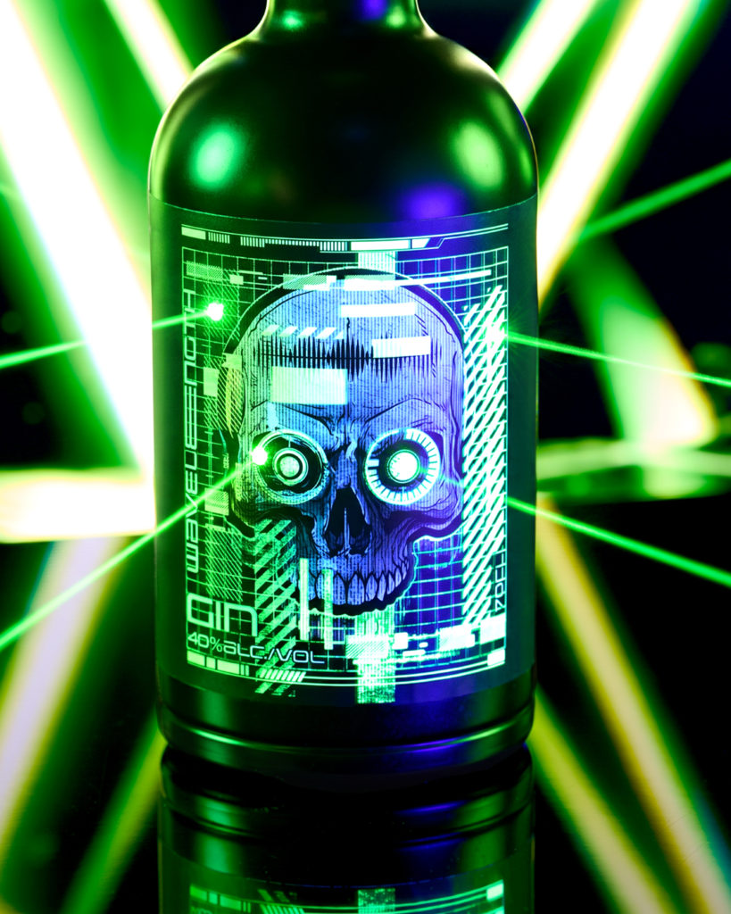
Three worlds, one bottle, two kinds of light.