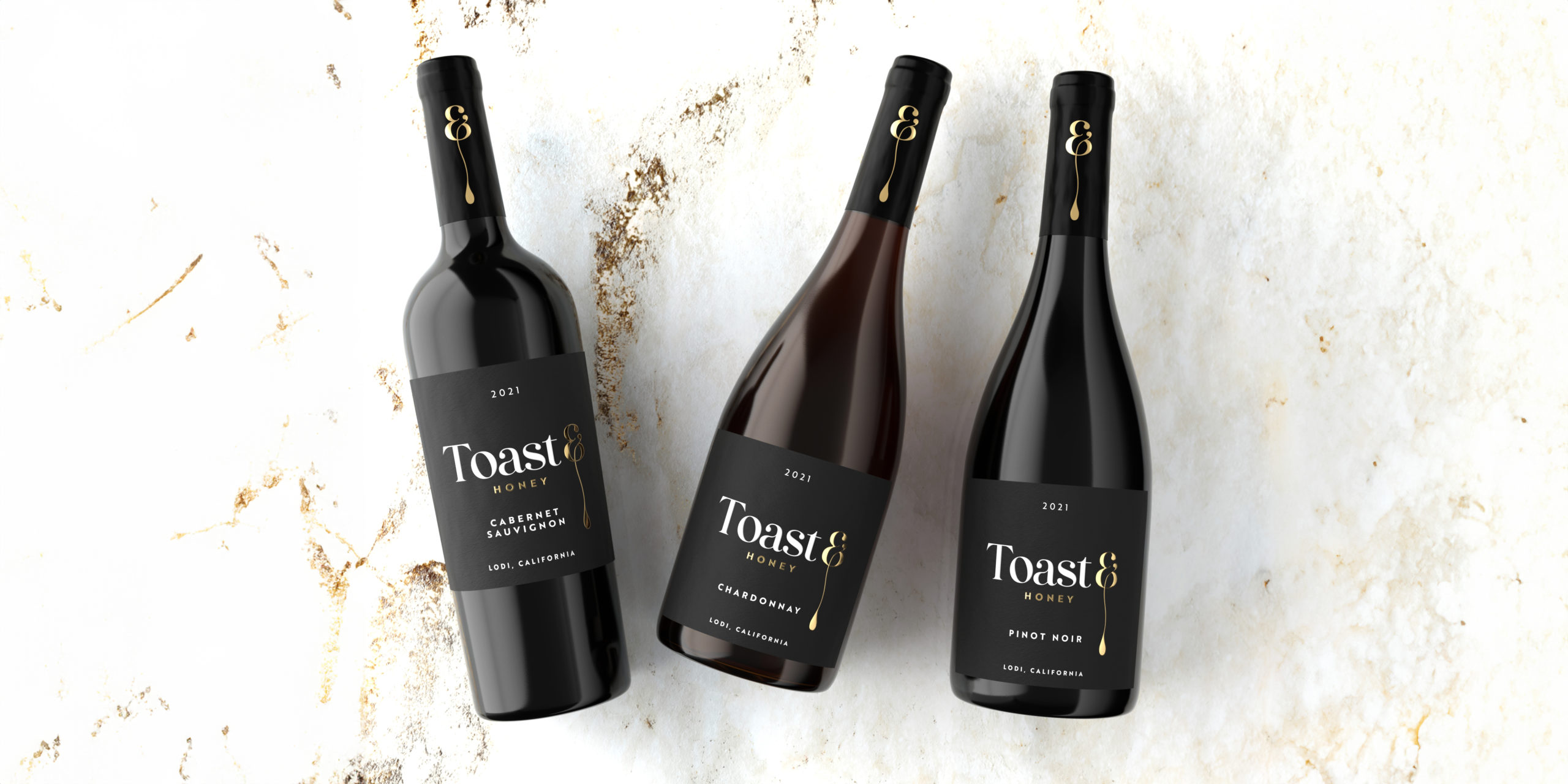
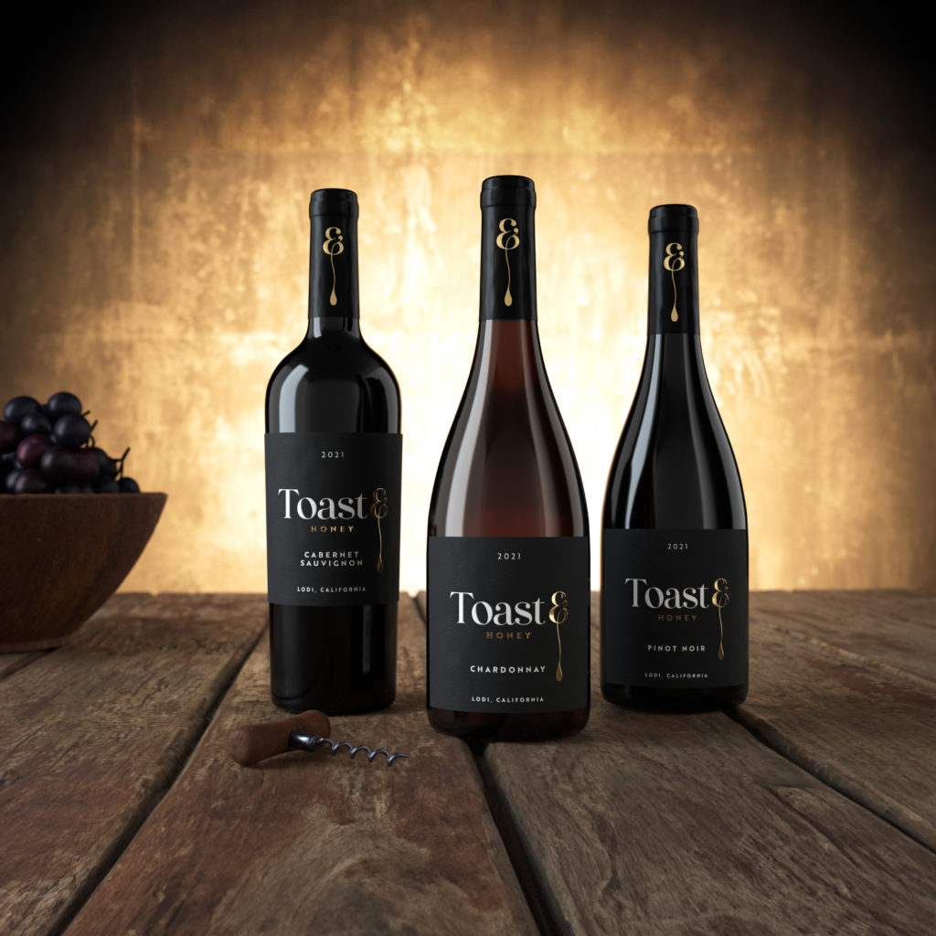
Embracing the harmony between two halves of the winemakers art.
Crafted exclusively for Majestic Wine, Toast & Honey is a premium New World wine collection that embodies everything there is to love about Californian wines.
Toast & Honey, a name inspired by the natural wine-making process, blends the toast of the winemaker’s charred barrels with silky, honey-inspired fruit flavours from some of California’s most renowned vineyards.
A minimal, sophisticated typographic brand mark perfectly embodied this premium New World wine. The focal point of this design is in the customised ampersand, running down to imitate the natural motion of dripping honey.
A lightly textured material paired with a simple honey-gold foil, perfectly embodies the premium and elegant nature of these wines.
“Graphic Brands were able to take an idea and bring it to life through a series
of workshops on brand identity, design look and feel. Graphic Brands helped
us make the right selections on materials to ensure the quality and aesthetics
of the finished dry goods reflected the premium nature of the brand.”
Jake Biggs | Buyer at Majestic Wine Ltd.