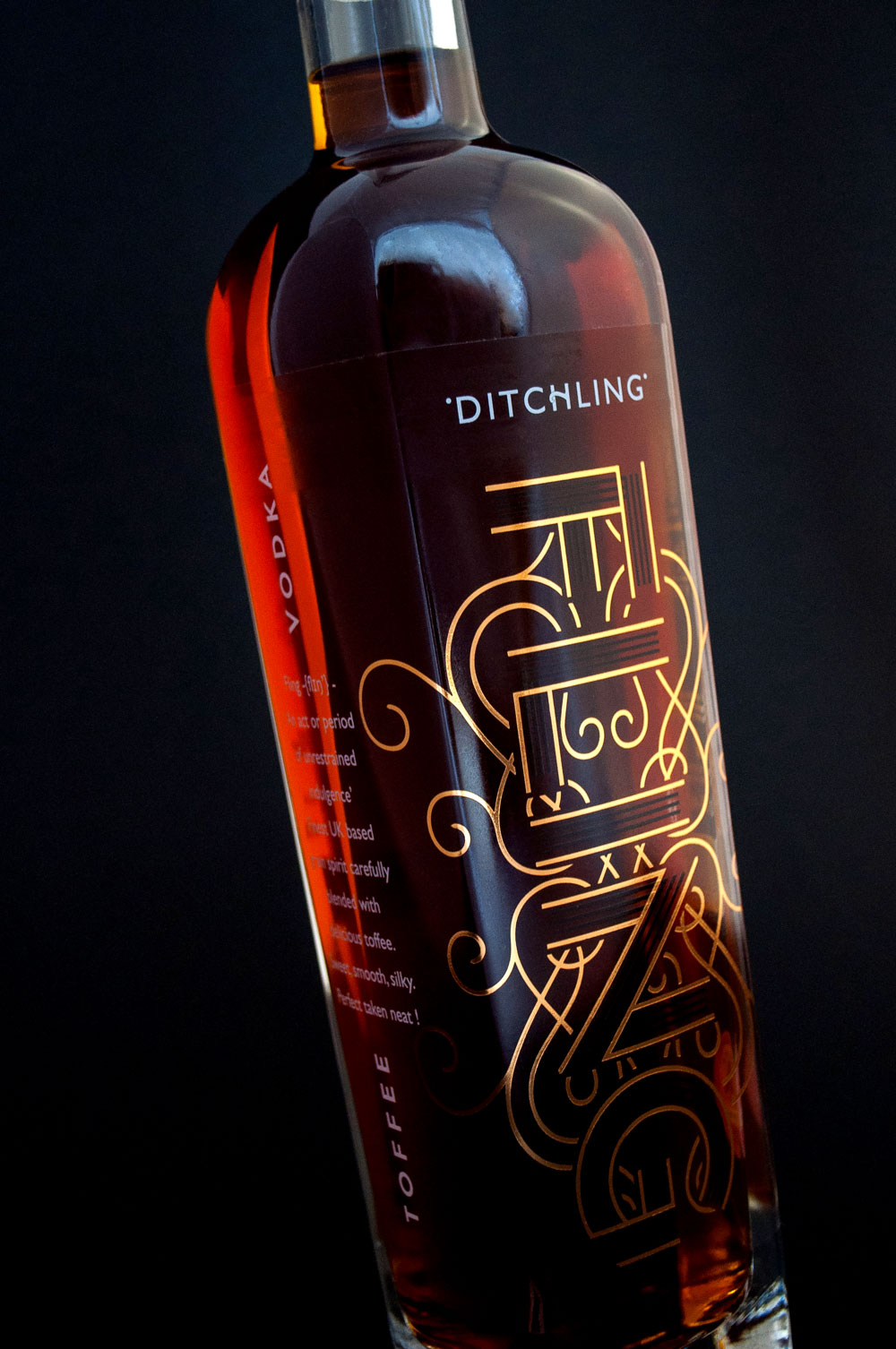
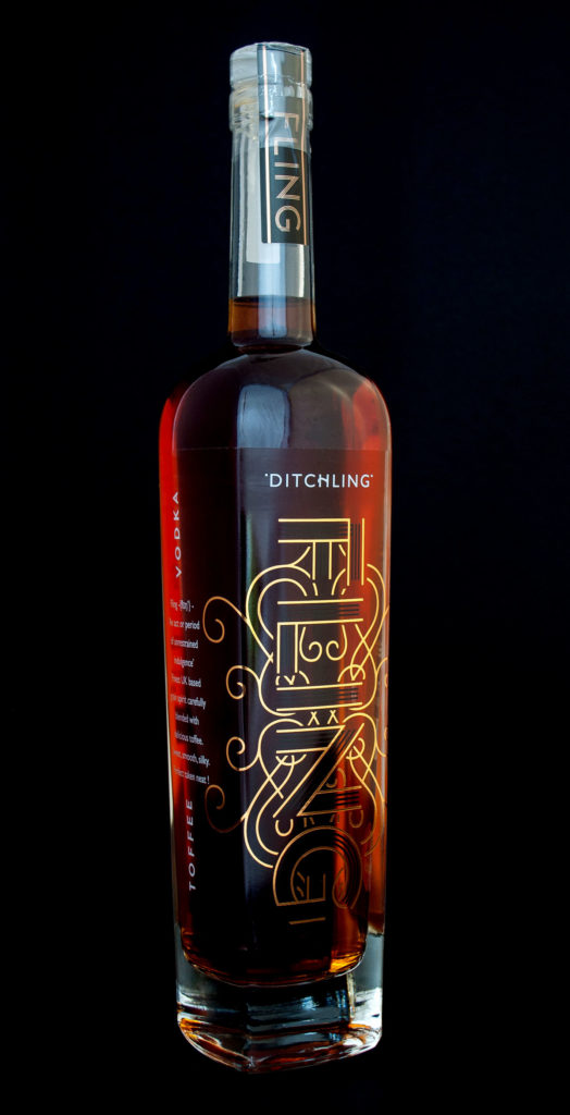
A distinctive and elegant looking packaging that reflects the quality of the product within.
The name FLING was chosen to reflect the sense of occasion as it means ‘indulgent revelry’! We wanted it to be something special, unique and different as the product is breaking into a new space – premium toffee vodka.
The branding needed to stand out in bars, but reflect the uniqueness and novelty of the product itself. It needed to reflect the ethos: ‘An act or period of unrestrained indulgence’, and that will make it stand out from the crowd and reflect the quality of the liquid within.
The classic gold and black colour combination used within the design is reminiscent of confectionery packaging, offering premium cues for consumers looking for a luxury drink to trade up from their usual tipple.
The liquid speaks for itself in terms of quality and taste, and the branding complements it with concise and strong details in its approach to instil trust into the younger end of the target market.
“Graphic Brands created a distinctive and elegant looking packaging;
a bottle that stands out on the bar shelf, in harmony with a stylish label
that reflects the quality of the product within.”
Crispin Mair | Director at Ditchling Spirits Ltd.