‘A spirit to lift the spirit’
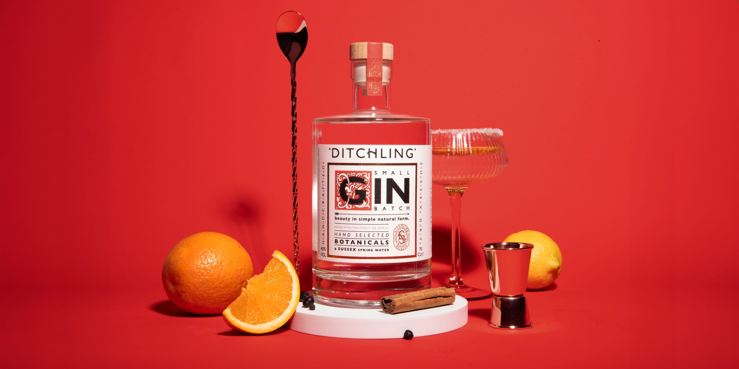
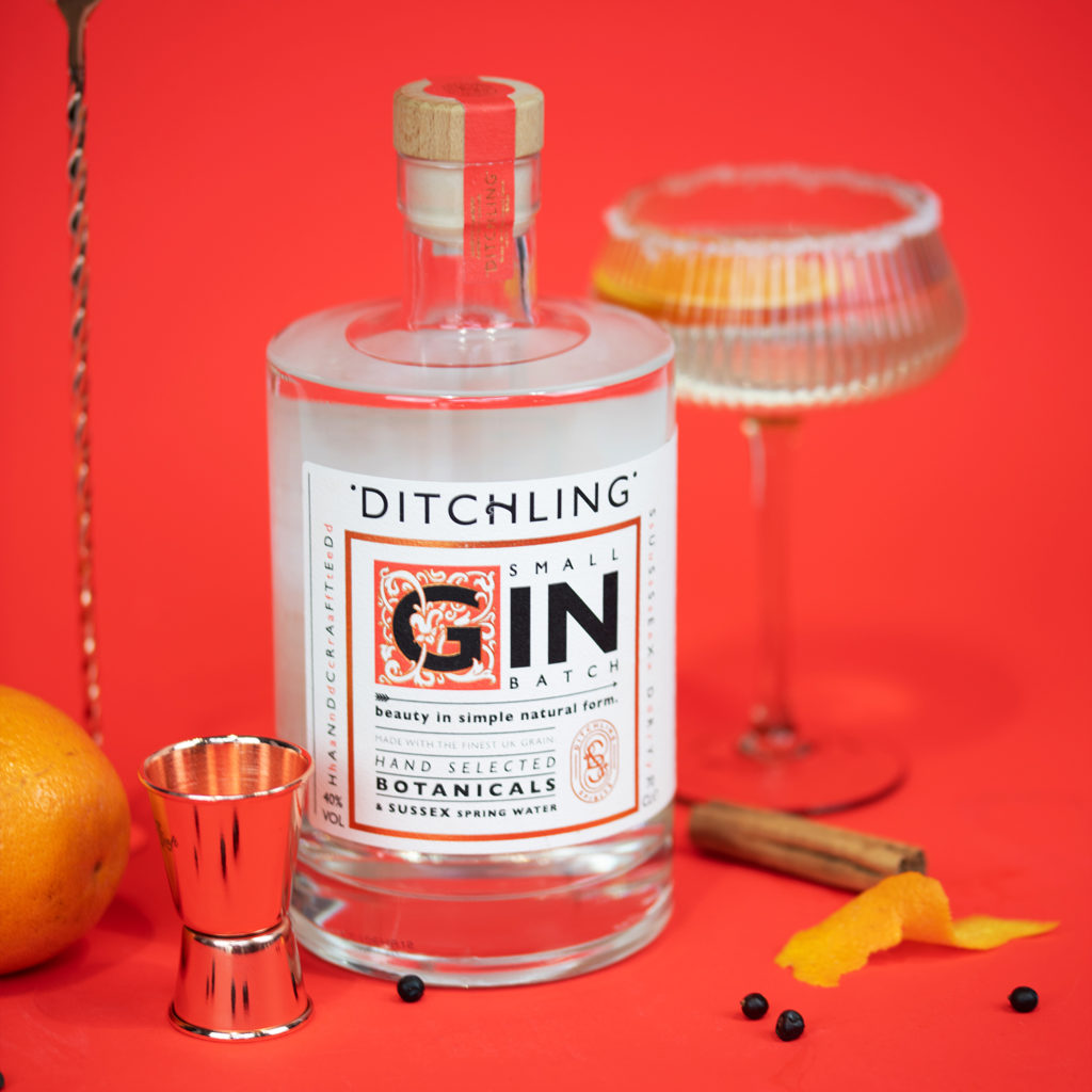
Crafted with a meticulous blend of locally foraged botanicals like juniper, coriander and angelica, all distilled in the pure waters of Sussex springs – Ditchling Gin, a timeless ‘London Dry’ style gin, boasts a rich, smooth flavour and subtle citrus finish.
After testing their small batch gin among the locals, and supplying a local village ball, Ditchling wanted to take the brand to the next level. Looking for something with a strong connection to Ditchling with an artisanal touch, where the focus shifts from the botanicals to the village’s legacy – Ditchling knew we were the team for the job!
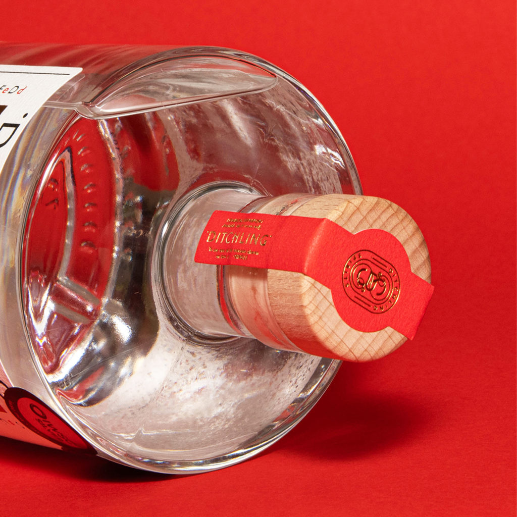
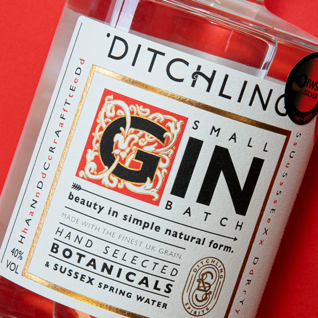
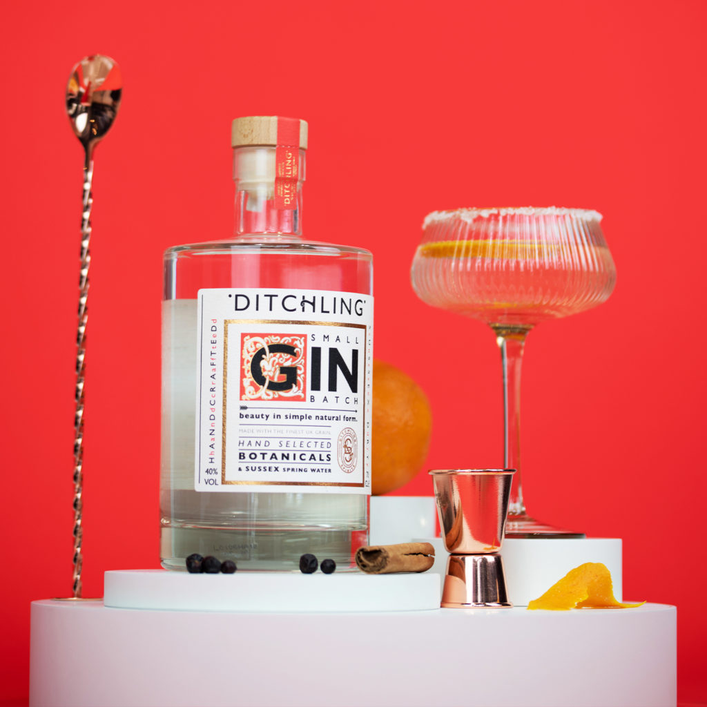
Inspired by artist, designer, and printmaker, Eric Gill, a brief resident of Ditchling, we experimented with woodcut prints alongside his iconic ‘Gill Sans’ – a quintessentially British typeface. Breaking away from the floral-heavy designs often seen on gin labels, we opted for the striking simplicity of a typographic lead design. Pairing this with a limited, but bold, colour palette and delicate foil details, it pays homage to history while subtly hinting at the gin’s exceptional quality and flavour.
“Beauty in simple natural form”
Crispin Mair | Director at Ditchling Spirits Ltd.